MODERN CSS STYLING APPROACHES

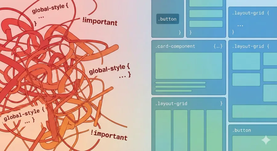
CSS has come a long way since I started web development. Back then, I'd have one massive styles.css file for an entire site. Making changes felt like playing Jenga - change one thing and something completely unrelated would break. Sound familiar?
Let me walk you through how CSS styling has evolved and share what I've learned about each approach.
How We Got Here
The Global Stylesheet Era
My first projects used a single stylesheet for everything. Simple sites? Fine. Anything larger? Chaos. Every style lived in the global scope, classes conflicted constantly, and specificity wars were a daily occurrence.
Independent Style Files
Things got slightly better when I started splitting CSS into separate files - one per page or component. Better organization, sure, but styles could still leak and conflict. I'd spend way too much time debugging why a button on page A looked broken because of CSS from page B.
Global Utility Classes
Then came the phase where everyone used utility classes like .btn, .text-center, .margin-10. Reusable styles sounded great in theory. In practice? You'd end up with hundreds of custom classes, and no one could remember what .helper-3 actually did without checking the stylesheet.
The mental overhead was real. Large projects with tons of custom global classes became impossible to work with. You'd be afraid to add new styles because you might accidentally override something important.
Modern Approaches That Actually Work
The CSS landscape has changed dramatically. Here's what I use now and why.
CSS Modules - Scoping Done Right
CSS Modules solved the global namespace problem. Styles are locally scoped by default, which means classes in one component can't affect another.
In React, it looks like this:
/* Button.module.css */
.button {
  background-color: blue;
}
import styles from "./Button.module.css";
<button className={styles.button}>Click Me</button>;
Vue has a similar pattern with the $style object:
<template>
  <p :class="$style.red">This should be red</p>
</template>

<style module>
.red {
  color: red;
}
</style>
No more worrying about class name conflicts. Game changer.
Scoped Styles in Vue/Nuxt
Vue's <style scoped> is one of my favorite features. Add scoped to your style tag and Vue automatically generates unique data attributes to isolate your styles:
<template>
  <div class="example">Scoped styles only apply here.</div>
</template>

<style scoped>
.example {
  font-size: 1.5rem;
  background-color: #242424;
  border: 1px solid white;
}
</style>
Under the hood, Vue generates something like .example[data-v-f137c5cf] - unique to that component. Your styles stay contained, and you can use simple class names without fear.
This is similar to localized <style> tags in raw HTML, but automated. Speaking of which...
Localized Style Tags in HTML
Before frameworks, you could manually scope styles using IDs or unique classes:
<section id="special-section">
  <style>
    #special-section h2 {
      color: green;
    }
  </style>
  <h2>Styled Heading in Special Section</h2>
</section>
It works, but it's tedious to maintain. This is why I love framework solutions - they automate this pattern.
Atomic CSS - My Current Go-To
I was skeptical about Tailwind CSS at first. Utility classes everywhere? Seemed messy. Then I used it on a project and completely changed my mind.
<button class="bg-blue text-white p-2 rounded">Click Me</button>
Here's why it clicked for me:
- No context switching - I stay in my HTML/JSX instead of jumping between files
- Predictable naming -
p-4means padding,bg-bluemeans blue background. No guessing. - Less CSS to maintain - My stylesheets are tiny because I'm reusing atomic utilities
- Rapid prototyping - I can build and iterate on UI incredibly fast
The key difference from custom utility classes? Tailwind's utilities are standardized and self-documenting. Everyone knows what text-center does. Good luck remembering what .helper-3 was supposed to do.
CSS-in-JS - When You Need Dynamic Styles
For components with state-dependent styling, CSS-in-JS libraries like Styled Components are powerful:
import styled from "styled-components";

const Button = styled.button`
  background-color: blue;
  color: white;
  padding: 10px;
`;
In Vue, you can achieve similar results with :style bindings and computed properties:
<template>
  <div :style="computedStyles">
    <slot />
  </div>
</template>

<script>
export default {
  props: {
    padding: {
      type: String,
      default: "8px"
    }
  },
  computed: {
    computedStyles() {
      return {
        padding: this.padding
      };
    }
  }
};
</script>
This approach shines when you need styles that change based on props or state.
CSS Variables - The Unsung Hero
CSS variables (custom properties) don't get enough love. Define them once at the :root level and use them everywhere:
:root {
  --color-primary: #007bff;
  --spacing-base: 16px;
}

.button {
  background-color: var(--color-primary);
  padding: var(--spacing-base);
}
I use these for theming all the time. Want to support light and dark modes? Just swap out the variable values. No need to rewrite a ton of CSS.
BEM - Still Relevant
BEM (Block Element Modifier) isn't dead. When I'm not using a framework or utility classes, BEM keeps my CSS organized and predictable:
.button--primary {
  /* primary button */
}
.button--secondary {
  /* secondary button */
}
.button__icon {
  /* icon inside button */
}
The naming convention makes relationships clear. It's verbose but explicit.
What I Recommend
After working with all these approaches, here's what I reach for:
- Utility-first CSS (Tailwind) for most projects - Fast development, minimal CSS to maintain
- Scoped styles (Vue) or CSS Modules (React) when I need component-specific styles that don't fit utilities
- CSS variables for theming and design tokens
- CSS-in-JS only when I need highly dynamic, state-dependent styling
Start with what solves your immediate pain point. For me, the biggest wins came from:
- Eliminating global CSS conflicts (scoped styles/CSS Modules)
- Reducing the mental overhead of custom classes (Tailwind)
- Making theming trivial (CSS variables)
Modern CSS is less about picking "the right way" and more about combining tools that make sense for your project. The goal is spending less time fighting CSS and more time building features.
CONTINUE READING
OPTIMIZING ASSETS FOR MAXIMUM WEB PERFORMANCE
To achieve a high-performance website, effective asset management is essential, especially when combined with mobile-first and backend optimization strategies.
December 14, 2025
FRONTEND BEST PRACTICES
Learn how to build clean, efficient, and reusable frontend components that scale effortlessly. Dive into best practices like component-driven development (CDD), where focusing on isolated UI elements can transform your approach to building modern, maintainable UIs.
December 14, 2025